Nord Widget Themes - Cool Blues and Calm Contrast
What Is the Nord Palette?
The Nord theme has become a developer and designer favorite for good reason. Born from Scandinavian minimalism, Nord blends polar night hues with frost highlights—perfect for distraction‑free setups. Its cool blues and gentle contrast make widgets legible and soothing.
The Nord color scheme consists of four distinct palettes: Polar Night (dark blues and blacks), Snow Storm (whites and off-whites), Frost (cool cyan and blue), and Aurora (accent colors). This creates a harmonious, low-contrast aesthetic that reduces eye strain during long work sessions.
Use deep backgrounds with accent cyan for highlights, or invert for a brighter arctic feel. Pair with minimalist icons and a monochrome wallpaper for cohesion.
Why Developers and Creatives Love Nord
Nord's popularity stems from its functional elegance. Unlike high-contrast themes that can feel aggressive, Nord offers visual comfort without sacrificing readability.
Pro Insight: Nord themes reduce cognitive load. The muted palette lets information stand out through structure rather than color, making it ideal for focus-intensive work like coding, writing, or design.
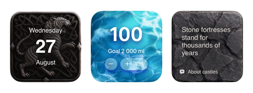
Be My Widget's Nord-inspired themes adapt this philosophy to iPhone home screens. Whether you're tracking tasks, monitoring weather, or viewing your calendar, the calm contrast keeps you centered throughout the day.
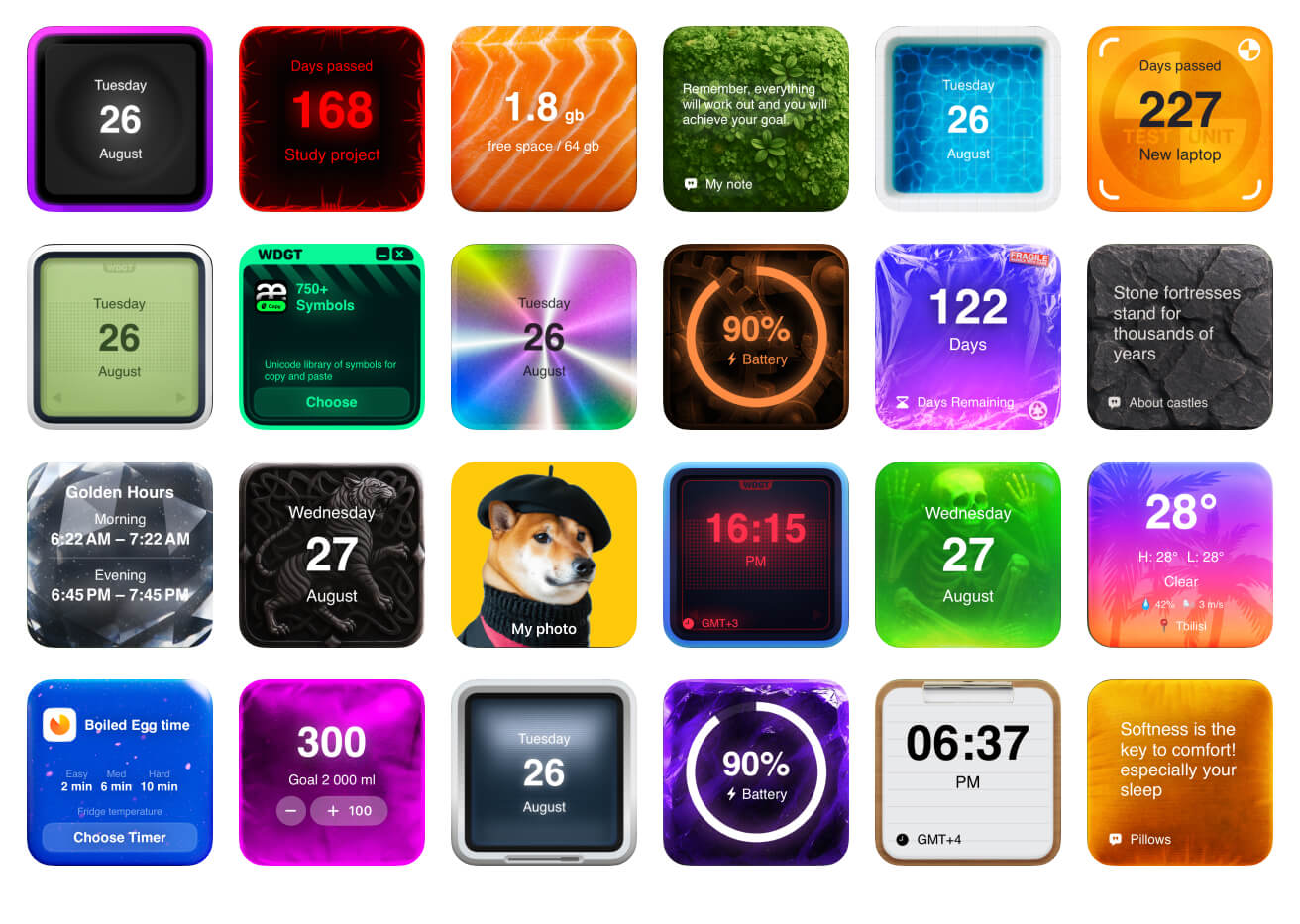
Nord Theme Recipes for Every Workflow
Start with 2–3 widgets and expand thoughtfully. Nord's strength is restraint.
- Focus Stack: Calendar + focus timer + notes for deep work
- Info Stack: Weather + battery + world clock for glanceable data
- Creator Stack: Quotes + sticky notes + countdown for projects
- Dark Nord: Deep navy base with teal accents for night mode
- Light Nord: Frost base with muted blue text for daytime clarity
- Developer Setup: Big clock + terminal-style notes + minimal calendar
Customizing Nord for Your Style
While Nord has defined colors, Be My Widget's Theme Editor lets you create variations:
- Warmer Nord: Add subtle amber or peach tints for sunrise vibes
- Midnight Nord: Push blacks deeper for OLED battery savings
- Arctic Nord: Emphasize frost tones for a brighter, icier aesthetic
- Forest Nord: Blend with green accents for nature-inspired calm
Frequently Asked Questions
Is Nord theme good for outdoor use?
Nord's low contrast can be challenging in direct sunlight. For outdoor visibility, consider using Light Nord variants or switching to a higher-contrast theme during daytime hours.
Can Nord themes work for non-technical users?
Absolutely! While popular among developers, Nord's calm aesthetic benefits anyone seeking a focused, minimal home screen. It's excellent for wellness tracking, journaling, and family organization.
How does Nord compare to monochrome themes?
Nord adds subtle blue and cyan tones to what would otherwise be grayscale, creating warmth without sacrificing the minimal aesthetic. Monochrome is starker; Nord is gentler.
Does Be My Widget support true Nord colors?
Yes. Our Nord themes use colors inspired by the official Nord palette (#2E3440, #88C0D0, #D8DEE9, etc.) and can be further customized in the Theme Editor.
Adopt a Calm, Productive Look
Nord themes keep your widgets legible and your mind focused.
Be My Widget includes 186 themes including Nord, Monochrome, and Tech styles.