Blue Widget Themes - Ocean Blues for a Calm iPhone
The Psychology of Blue: Calm Focus for Your Home Screen
Blue widget themes deliver instant serenity. Psychologically, blue evokes calm, trust, and mental clarity—making it the perfect choice for iPhone home screens that need to balance aesthetics with functionality.
Blue evokes calm and clarity. Pair ocean gradients with white typography for a breezy layout that stays readable indoors and outdoors. From pastel sky to deep cobalt, pick tones that match your wallpaper and icons.
Great for productivity dashboards and minimal setups, blue themes work equally well for professionals, students, and anyone seeking a distraction-free home screen experience.
Creating Your Blue iPhone Theme Setup
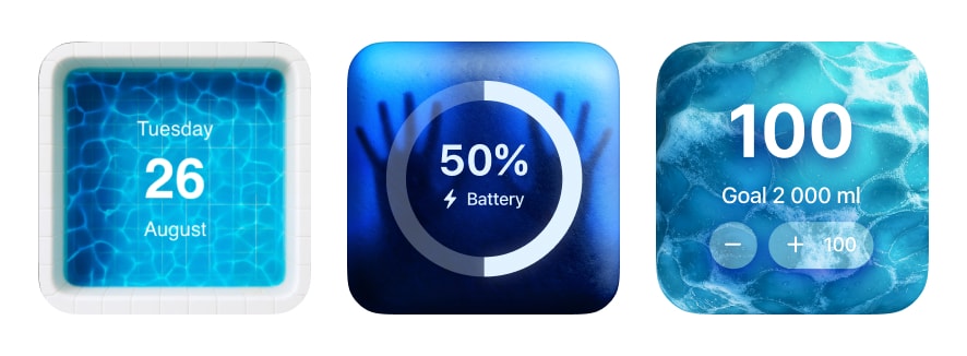
Start with a blue-toned wallpaper—ocean photography, abstract gradients, or sky landscapes all provide excellent foundations. Choose your blue intensity based on your use case: pastel blues for creative work, deep navy for focus sessions, or vibrant cyan for energy.
Design Insight: Blue themes excel in outdoor visibility. If you frequently check your phone in bright sunlight, blue backgrounds with white or cream text offer superior legibility compared to warmer tones.
Be My Widget offers multiple blue variations across its 186 themes—from Arctic frost to tropical ocean. The Theme Editor allows you to customize any theme with blue tints, adjust saturation for muted or vibrant looks, and layer subtle overlays for depth.
Blue Widget Theme Color Pairings
Use accent colors strategically to highlight key information while maintaining your blue aesthetic:
- Blue + White: Clean, airy, timeless—perfect for minimalist setups
- Blue + Gold: Luxurious yet modern, adds warmth without losing focus
- Blue + Pink: Soft creative energy for artistic workflows
- Blue + Black: High contrast for outdoor readability and professional appearance
- Nord Blue: Muted cyan with gray neutrals for developer-favorite aesthetics
- Blue + Coral: Unexpected pop that energizes without overwhelming
Best Use Cases for Blue Themes
Blue widget themes shine in specific scenarios:
- Productivity: Calendar, task lists, and time tracking widgets feel professional and focused
- Wellness: Water tracking, meditation timers, and sleep schedules benefit from calming blue palettes
- Travel: Weather, world clock, and photo widgets capture oceanic wanderlust
- Tech Work: Developers and designers appreciate blue's neutral backdrop for code and creative tools
Frequently Asked Questions
Do blue themes cause eye strain at night?
Bright blues can be stimulating. For evening use, choose darker navy or slate blue themes, or enable iOS's automatic dark mode to reduce blue light exposure before bed.
What's the difference between Nord blue and regular blue themes?
Nord themes use a specific color palette with muted cyan (#88C0D0) and frost tones, while regular blue themes span the full spectrum from sky to navy. Nord is ideal for developers and minimal aesthetics.
Can I mix blue themes with other color widgets?
Absolutely. Blue serves as an excellent neutral base. Try accent widgets in gold, coral, or white to create visual hierarchy while maintaining a cohesive blue-dominated home screen.
Refresh Your Screen with Ocean Energy
Blue themes offer clarity and calm for work or leisure.
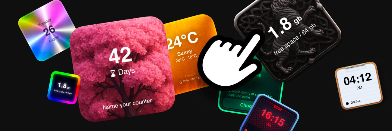
Be My Widget includes 186 themes including Blue, Nord, and Monochrome styles.