Baseball Scoreboard Home Screen Theme
The feeling behind the look
Good widget design begins with a moment that currently causes friction. Classic scoreboards use simple type, strong spacing, and a limited palette that translates well to widgets. A strong baseball widget theme iPhone begins with that feeling, then translates it into color, type, spacing, and image treatment.
For baseball fans who want a nostalgic but functional game-day page, the goal is a scoreboard-inspired system for dates, countdowns, notes, and schedule references—a direction that remains useful after the trend passes.
Build a palette with a clear hierarchy
Build the layout from the most time-sensitive detail outward. Use scoreboard green, cream, warm amber, and deep navy as the palette rule. Pick one dominant neutral, one recognizable accent, and one readable text color before adding gradients or texture.
Use condensed labels, dark green or navy surfaces, and warm illuminated numerals. This connects different card layouts so the result feels curated rather than copied.
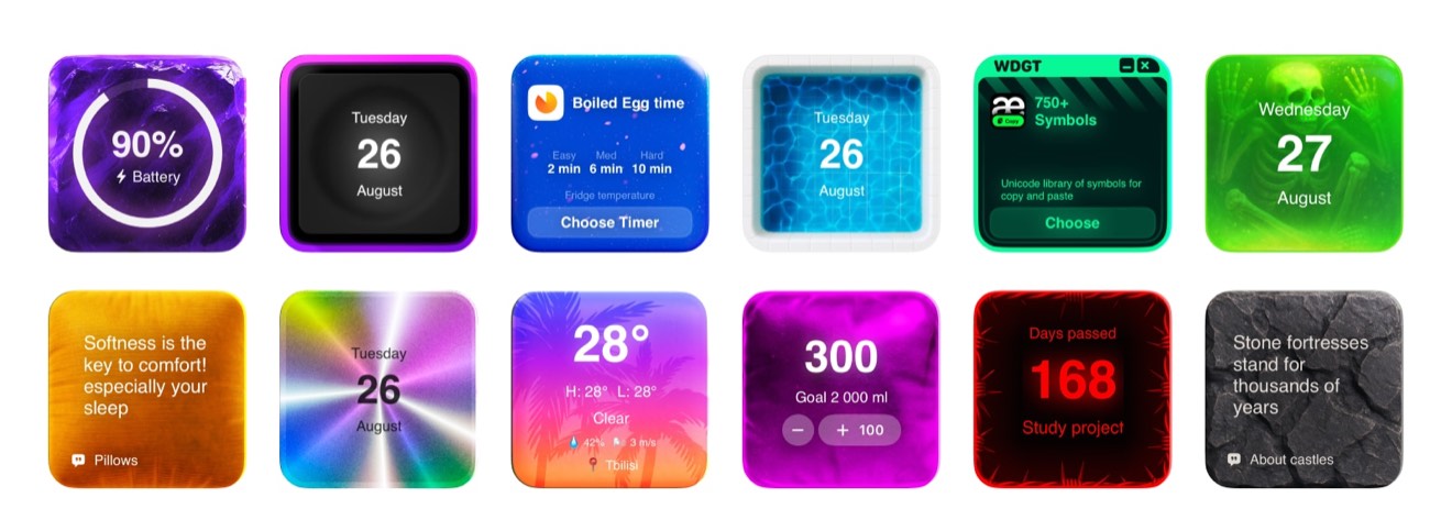
This broad theme view establishes scoreboard green, cream, warm amber, and deep navy before individual cards are tuned.
Create the theme in four deliberate steps
- Choose the mood. Start from this design brief: Classic scoreboards use simple type, strong spacing, and a limited palette that translates well to widgets. Select a wallpaper that supports a scoreboard-inspired system for dates, countdowns, notes, and schedule references.
- Select a base theme. Browse Be My Widget's 200+ themes for a foundation suited to baseball fans who want a nostalgic but functional game-day page. Favor scoreboard green, cream, warm amber, and deep navy.
- Personalize it. Follow this direction: Use condensed labels, dark green or navy surfaces, and warm illuminated numerals. Then adjust tint, contrast, blur, and crop until the information remains easy to read.
- Repeat one cue. Carry the palette through two real tests: Count down to first pitch. Style a series schedule note.
Contrast test: Use a ballpark photo sparingly. Consistency test: Keep external scores separate from decorative cards. Good iphone widget themes preserve each card's job.
Ways to use this visual direction
- Fast check: Count down to first pitch.
- Planning moment: Style a series schedule note.
- Shared context: Use a ballpark photo sparingly.
- Personal cue: Keep external scores separate from decorative cards.
Design check: Take a screenshot after this use case: Count down to first pitch. Identify what attracts attention first. If the palette—scoreboard green, cream, warm amber, and deep navy—overwhelms the useful value, simplify the background or strengthen the type contrast.
Pair atmosphere with readable widgets

The detailed example turns a scoreboard-inspired system for dates, countdowns, notes, and schedule references into a readable widget system.
Expressive test: Count down to first pitch. Calm test: Style a series schedule note. This helps baseball fans who want a nostalgic but functional game-day page create an intentional custom home screen iphone layout.
Test the screen by day and night. First, use a ballpark photo sparingly. Then, keep external scores separate from decorative cards. Small changes to scoreboard green, cream, warm amber, and deep navy and font weight improve hierarchy.
Frequently Asked Questions
Will this theme work with a busy wallpaper?
Yes, if you add enough contrast. Use blur, a darker overlay, or a quieter crop behind text-heavy widgets and test the result in both bright and dim conditions.
Do all widgets need the same color?
No. Repeating one accent, one neutral, and one typography style usually feels more intentional than forcing every card to look identical.
Can I make a personal version?
Yes. Start with a Be My Widget theme, then use Theme Editor to add your own image, tune color and brightness, and save a version that fits your wallpaper.
Build a Home Screen That Helps
Be My Widget brings 28+ widgets, 200+ themes, and Theme Editor tools into one flexible visual toolkit. Start with the useful job described in this guide, then make the result feel personal.
Keep the layout focused, verify changing information at its source, and let every glance move the day forward.